What is Interaction Design? Principles, Process, Examples
Appinio Research · 03.06.2025 · 35min read
Content
Are you ready to dive into the dynamic world of Interaction Design, where every click, tap, and swipe holds the power to shape memorable digital experiences? This guide will unravel the intricacies of Interaction Design, from its fundamental principles to the tools and techniques that bring user-centered design to life.
Whether you're a seasoned designer seeking to refine your skills or a newcomer eager to explore this exciting field, this guide will equip you with the knowledge and insights needed to craft interactions that resonate with users and elevate the digital landscape.
What is Interaction Design?
Interaction Design (IxD) is a multidisciplinary field that focuses on creating meaningful and engaging interactions between users and digital products. It goes beyond aesthetics to ensure that the functionality, usability, and overall experience of a digital product are exceptional. Understanding the definition and importance of Interaction Design is foundational to its practice.
Interaction Design encompasses the following key aspects:
- User-Centered: It places users at the core of the design process, aiming to meet their needs, preferences, and expectations.
- Holistic Approach: Interaction Design considers the entire user journey, from the first interaction to task completion, encompassing various touchpoints and devices.
- Functionality and Usability: It ensures that digital products not only look good but also function intuitively, making it easy for users to achieve their goals.
- Aesthetics and Emotional Appeal: Interaction Design strives to create visually pleasing and emotionally resonant experiences, enhancing user engagement and satisfaction.
- Iterative Process: It involves continuous testing and refinement, adapting designs based on user feedback and changing technological landscapes.
Importance of Interaction Design
The importance of Interaction Design lies in its ability to:
- Enhance User Satisfaction: Well-designed interactions lead to positive user experiences, increasing user satisfaction and loyalty.
- Boost Engagement: Engaging interactions hold users' attention and encourage them to explore and use a digital product more extensively.
- Reduce Errors and Confusion: Thoughtful design minimizes user errors and confusion, reducing frustration and support requests.
- Support Business Goals: Effective Interaction Design can drive conversions, improve user retention, and contribute to the overall success of a product or service.
- Meet Accessibility Standards: It ensures that digital products are accessible to individuals with disabilities, fostering inclusivity and compliance with legal requirements.
Role of Interaction Design in User Experience
Interaction Design is an integral component of the broader field of User Experience (UX) design. It plays a pivotal role in shaping how users engage with and perceive digital products. Here are key roles Interaction Design fulfills within the realm of UX:
- Creating Intuitive Interfaces: Interaction Designers craft interfaces that users can navigate effortlessly, ensuring that interactions are intuitive and natural.
- Facilitating User Goals: By understanding user needs and goals, Interaction Designers align digital products with user expectations, making it easier for users to accomplish tasks.
- Enhancing Usability: Interaction Design aims to optimize usability by reducing cognitive load, streamlining workflows, and presenting information in a clear and digestible manner.
- Promoting Consistency: Consistent interaction patterns and visual elements across a digital product contribute to a coherent and enjoyable user experience.
- Empowering Engagement: Through engaging and delightful interactions, Interaction Design fosters user engagement, encouraging users to interact more deeply with a product.
Interaction Design is the bridge that connects users to digital products, shaping their experiences and influencing their perceptions. Its role is pivotal in ensuring that technology serves as a tool for users to achieve their goals, fostering positive user experiences and achieving business objectives.
Fundamentals of Interaction Design
Interaction Design is rooted in several foundational principles and practices that form the bedrock of user-friendly digital experiences. Let's explore these fundamentals in greater detail.
User-Centered Design Principles
User-centered design is at the heart of Interaction Design. It places your users' needs and preferences front and center throughout the design process. Here's a deeper dive into the principles:
- Empathy for Users: Truly understanding your users' perspectives and experiences is the cornerstone of user-centered design. This involves putting yourself in their shoes to grasp their motivations and challenges.
- Iterative Approach: User-centered design is not a one-time endeavor. It involves a continuous cycle of designing, testing, gathering feedback, and refining the design. This iterative process ensures that your product evolves to meet user needs effectively.
- Simplicity and Clarity: The goal is to make interactions as simple and intuitive as possible. Users should be able to navigate your product without confusion or frustration, reducing cognitive load.
Understanding User Needs and Goals
Before embarking on any design journey, it's crucial to dig deep into understanding who your users are and what they aim to achieve. Here's how you can delve into these aspects:
- User Profiling: Develop user personas that represent different segments of your audience. These personas help you create a clear picture of your users' characteristics, preferences, and pain points.
- Needs Assessment: Identify your users' core needs and objectives when interacting with your product. What problem are they trying to solve, or what goal are they trying to accomplish?
- User Journeys: Map out the typical pathways users take to accomplish their goals within your product. Understanding these journeys helps you design with context in mind.
User Research and Analysis
User research and analysis are instrumental in shaping your design decisions. Here are some methods and techniques to consider:
- Usability Testing: Conduct usability tests with actual users to observe how they interact with your product. This hands-on approach reveals usability issues and provides insights for improvement.
- Surveys and Questionnaires: Gather quantitative data by creating surveys and questionnaires to understand user preferences and opinions.
- Analytics and Data Mining: Leverage analytics tools to collect data on user behavior within your digital product. Analyzing this data can unveil usage patterns and areas where users may struggle.
Establishing Design Objectives
Clear and well-defined design objectives act as guiding stars for your interaction design process. Here's how to set them effectively:
- Align with User Needs: Ensure that your design objectives directly align with the needs and goals of your target users. These objectives should serve as solutions to their problems or enhancements to their experiences.
- Measurable Goals: Make your objectives measurable. Use key performance indicators (KPIs) to track progress and success. For example, an objective might be to reduce the time it takes for users to complete a specific task by 20%.
- Prioritization: Not all objectives are of equal importance. Prioritize them based on their impact on the user experience and the overall success of your product.
By embracing these fundamentals of Interaction Design, you'll lay a strong foundation for creating digital products that resonate with your audience, meet their needs, and stand out in terms of user experience.
User Interface Design
Creating an effective and visually pleasing user interface (UI) is pivotal in Interaction Design. Your UI serves as the bridge between users and your digital product, and it significantly influences their experience. Let's delve into the essential aspects of UI design.
Visual Hierarchy and Layout
Visual hierarchy and layout play a crucial role in guiding users through your digital product and presenting information in a logical and engaging manner.
- Focal Points: Establish clear focal points to direct users' attention to the most important elements or information on a screen. This can be achieved through size, color, or positioning.
- Grid Systems: Employ grid systems to organize content systematically. Grids help maintain consistency in layout and make it easier for users to navigate.
- Whitespace: Utilize whitespace effectively to improve readability and reduce clutter. Proper spacing between elements enhances overall aesthetics.
Typography and Readability
The choice of fonts and how you implement them greatly impacts the legibility and readability of your UI.
- Font Selection: Choose fonts that align with your brand and are easily read. Ensure that fonts are legible in different sizes and on various devices.
- Hierarchy in Text: Create visual hierarchy in text through variations in font size, weight, and color. Headings should stand out from the body text, making it easier for users to scan and understand the content.
- Line Spacing and Line Length: Adjust line spacing (leading) and line length to enhance readability. Longer lines of text may require more line spacing to prevent eye fatigue.
Color Theory and Usage
Color has the power to evoke emotions, convey information, and enhance aesthetics. Understanding color theory is vital in UI design.
- Color Psychology: Consider the psychological impact of colors when choosing your palette. For example, blue often signifies trust and calmness, while red can represent urgency or excitement.
- Color Schemes: Create harmonious color schemes that complement your brand and convey the desired mood or message. Use tools like color wheels to find complementary and analogous colors.
- Accessibility: Ensure your color choices are accessible to all users, including those with visual impairments. Check contrast ratios and provide alternative color options for better accessibility.
Iconography and Imagery
Icons and imagery can convey information and meaning more quickly than text alone.
- Icon Design: Design icons that are intuitive and easy to understand without the need for accompanying text. Test them with users to ensure clarity.
- Image Selection: Choose images that resonate with your audience and enhance the content. High-quality, relevant images can evoke emotions and improve engagement.
- Consistency: Maintain consistency in iconography and imagery style throughout your product. Consistency reinforces familiarity and usability.
Consistency in UI Elements
Consistency in UI elements is vital for providing a smooth and intuitive user experience.
- UI Components: Ensure that UI elements such as buttons, forms, and navigation menus have a consistent appearance and behavior across your product.
- Design Patterns: Follow established design patterns and conventions. Users are accustomed to certain interactions, and deviating too far from these can cause confusion.
- Pattern Libraries and Design Systems: Consider creating pattern libraries or design systems that document and standardize UI elements. These resources are valuable for design teams and developers.
By mastering these aspects of User Interface Design, you'll be well on your way to creating visually appealing and user-friendly digital products. Keep in mind that UI design is not static; it should evolve and adapt based on user feedback and emerging design trends.
Interaction Patterns and Navigation
In the realm of Interaction Design, how users navigate and interact with your digital product is a crucial aspect that can make or break the user experience. We'll delve into various facets of interaction patterns and navigation to ensure that your users can explore and utilize your product seamlessly.
Navigation Systems
Navigation systems serve as the roadmap for users as they navigate through your digital landscape. They are the signposts guiding users to their desired destinations.
- Menu Design: Craft intuitive navigation menus that are easy to understand and use. Consider hierarchical structures for larger websites or applications.
- Breadcrumb Trails: Implement breadcrumb trails to help users understand their location within your product. This aids in backtracking or moving to higher-level sections effortlessly.
- Search Functionality: Provide a robust search feature to enable users to find specific content quickly. Incorporate auto-suggestions and filters for an enhanced search experience.
Information Architecture
Information architecture is akin to the foundation of a well-structured building. It defines the organization and structure of content within your product.
- Sitemaps: Develop sitemaps that illustrate the hierarchy and relationships between different sections and pages of your product. This visual representation aids in planning and organization.
- User Flows: Map out user flows that depict the paths users are likely to follow within your product. This helps in understanding the sequence of interactions.
- Card Sorting: Conduct card sorting exercises with users to determine how they expect content to be categorized and organized.
Gestures and Feedback
Understanding gestures and providing timely feedback is paramount in an era of touchscreen devices and diverse input methods.
- Gesture-Based Interactions: Design interactions that align with common gestures, such as swiping, pinching, or tapping. Ensure these gestures are intuitive and responsive.
- Feedback Mechanisms: Provide visual and auditory feedback to acknowledge user actions. This confirms that the system has registered their input.
- Progress Indicators: For tasks that take time to complete, offer progress indicators or loading animations to keep users informed and patient.
Error Handling and Recovery
No system is perfect, and errors may occur during user interactions. Effective error handling and recovery mechanisms are vital for maintaining a positive user experience.
- Error Messages: Craft clear, user-friendly error messages explaining the issue and suggesting potential solutions. Avoid technical jargon.
- Validation: Implement real-time validation to catch errors before users submit forms or actions. For instance, validate email addresses or passwords as users type.
- User Assistance: Offer contextual help or tooltips to guide users on how to rectify errors. Provide links to relevant support or FAQ sections.
By understanding and implementing these interaction patterns and navigation principles, you can ensure that your users navigate your digital product effortlessly and have a pleasant, error-free experience. User feedback and testing play a crucial role in fine-tuning these aspects to meet user expectations effectively.
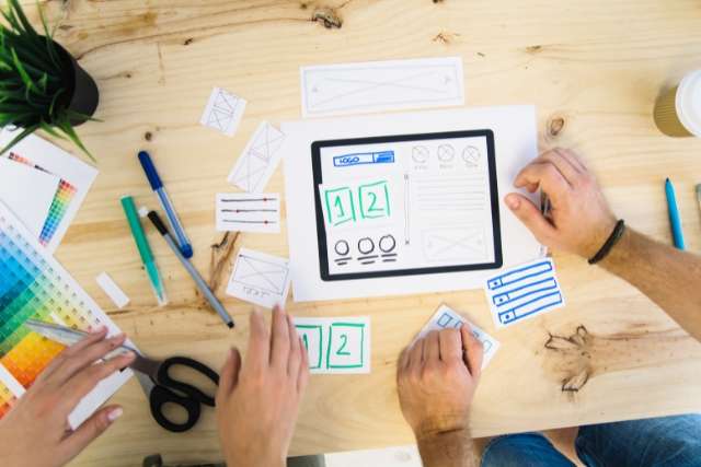
Prototyping and Wireframing
Prototyping and wireframing are indispensable tools in the Interaction Designer's arsenal. They allow you to transform abstract ideas into tangible, testable designs. We will explore the intricacies of prototyping and wireframing, from the initial stages of low-fidelity concepts to high-fidelity, interactive representations of your digital product.
Low-Fidelity Prototyping
Low-fidelity prototypes serve as the initial sketches of your design concepts. They are rough, simple, and aimed at quickly visualizing ideas without investing too much time or resources.
- Sketching: Begin by sketching your ideas on paper or using digital sketching tools. These sketches don't need to be detailed; they should capture the basic layout and flow of your design.
- Paper Prototypes: Create paper prototypes by cutting out and arranging paper elements representing interface components. This allows for quick and inexpensive testing of ideas.
- Digital Wireframes: Use wireframing tools to create digital representations of your design ideas. These wireframes should focus on layout, structure, and content placement.
High-Fidelity Prototyping
High-fidelity prototypes are advanced representations of your design, closely resembling the final product. They are used for in-depth testing and to demonstrate the user experience.
- Interactive Prototypes: Build interactive prototypes that allow users to click through and interact with your design as if it were a functional product. Tools like Figma, Adobe XD, or InVision are commonly used for this purpose.
- Visual Design Elements: Incorporate visual design elements, such as colors, typography, and images, into high-fidelity prototypes. This helps users get a more realistic feel for the final product's aesthetics.
- Usability Testing: Conduct usability testing with high-fidelity prototypes to gather feedback on the user experience. These tests can reveal any potential issues before development begins.
Usability Testing with Prototypes
- Test Scenarios: Define specific tasks and scenarios for users to complete while interacting with your prototype. These tasks should reflect common user goals and interactions.
- User Observation: Observe how users interact with your prototype. Pay attention to their actions, feedback, and any difficulties they encounter.
- Feedback Gathering: After each usability test, collect user feedback through interviews or questionnaires. Encourage them to share their thoughts, feelings, and suggestions.
- Iterative Design: Use the insights gained from usability testing to refine and iterate on your design. Make necessary adjustments to enhance usability and user satisfaction.
By mastering the art of prototyping and wireframing and conducting thorough usability testing with prototypes, you can fine-tune your digital product, ensuring it meets user needs and expectations while minimizing the risk of costly design flaws during development.
Examples of Interaction Design
Exploring real-world examples of Interaction Design can provide valuable insights into how principles and techniques are applied to create user-centric digital experiences. Here, we'll dive into several examples to illustrate the impact of Interaction Design in various contexts:
Apple's iPhone Gestures
Apple revolutionized the smartphone industry with its iPhone's gesture-based interactions. The simple swipe, pinch, and tap gestures replaced physical buttons and made navigation more intuitive. Gestures not only improved user experience but also set a standard for the industry, demonstrating the power of thoughtful Interaction Design.
Google's Material Design
Material Design is Google's design language that embodies principles of Interaction Design. It emphasizes tactile and visually engaging interactions, such as the ripple effect when tapping a button. Material Design provides consistency across Android apps, creating a seamless and familiar experience for users.
Airbnb's Booking Flow
Airbnb's booking process is an example of Interaction Design that simplifies a complex task. Users can effortlessly browse listings, filter options, and book accommodations. The flow incorporates clear information hierarchy, ensuring users always know their next steps, resulting in a smooth and enjoyable booking experience.
Tesla's Touchscreen Interface
Tesla's electric vehicles feature a touchscreen interface for controlling various functions. Interaction Design is evident in the responsive touch gestures, intuitive menu layouts, and visual feedback provided when adjusting settings. The design enhances the driving experience while prioritizing safety.
Duolingo's Gamified Learning
Duolingo gamifies language learning through engaging interactions. It employs elements like progress bars, rewards, and interactive exercises to keep users motivated and on track. The app's design encourages consistent learning and helps users achieve their language-learning goals.
These examples showcase the versatility and impact of Interaction Design across diverse industries and applications. They illustrate how thoughtful design can lead to enhanced user experiences, increased engagement, and even industry-wide innovation. Studying such examples can inspire and inform your own design projects, helping you create interactions that resonate with your target audience.
Usability and User Testing
Creating an exceptional user experience doesn't happen by chance; it requires careful planning, execution, and refinement. Usability testing is the cornerstone of Interaction Design, allowing you to validate your design decisions and make user-centered improvements.
Conducting Usability Tests
Usability testing is the process of observing real users as they interact with your digital product. This invaluable method provides insights into how well your design performs and where improvements are needed.
- Test Participants: Select a diverse group of participants representing your target audience. Aim for a mix of demographics, including age, gender, and experience levels.
- Test Scenarios: Develop test scenarios and tasks that align with common user goals. These scenarios should reflect typical interactions users would have with your product.
- Moderated vs. Unmoderated: Decide whether you'll conduct moderated (with a facilitator guiding users) or unmoderated (self-guided) usability tests based on your objectives and resources.
- Observation and Recording: Watch users as they navigate your product, paying close attention to their actions, reactions, and verbal feedback. Record the sessions for later analysis.
Analyzing User Feedback
Collecting data during usability tests is only the beginning. The real value lies in the analysis of this feedback to identify usability issues and areas for improvement.
- Quantitative Data: Use metrics like task completion rates, time on task, and error rates to quantify the usability of your design. These metrics provide objective insights.
- Qualitative Feedback: Don't underestimate the power of qualitative feedback. User comments, frustrations, and suggestions can reveal underlying usability problems and user perceptions.
- Affinity Diagrams: Create affinity diagrams to group and categorize user feedback. This visual representation helps identify patterns and prioritize issues.
- Heatmaps and Click Tracking: Utilize tools like heatmaps and click tracking to visualize user interactions with your product. These tools can highlight areas of interest and confusion.
Iterative Design and Improvement
Usability testing isn't a one-time event but an ongoing process that drives iterative design and continuous improvement.
- Prioritizing Issues: After usability testing, prioritize the identified issues based on severity and impact on the user experience. Focus on critical issues first.
- Design Iterations: Use the insights gained from usability testing to make iterative design changes. Refine your product by addressing usability issues and implementing user suggestions.
- Testing at Each Stage: Incorporate usability testing into every stage of your design process, from low-fidelity prototypes to high-fidelity designs. This ensures that improvements are validated.
- User-Centered Approach: Maintain a user-centered approach throughout your design journey. Continuously gather user feedback and adapt your product to evolving user needs.
Usability testing and the subsequent analysis of user feedback are integral parts of Interaction Design. They guide you toward creating digital products that not only meet but exceed user expectations. By embracing an iterative design process, you'll refine your product, enhance user satisfaction, and achieve lasting success in the digital landscape.
Mobile and Responsive Design
With the proliferation of mobile devices, designing for various screen sizes and ensuring an optimal user experience across different platforms is essential. Let's explore the principles of mobile-first design, responsive web design, and adapting your digital product to accommodate various screen sizes.
Mobile-First Design Principles
Mobile-first design is a philosophy that advocates starting the design process with mobile devices in mind. This approach ensures that your digital product is accessible and functional on smaller screens before scaling up to larger ones.
- Content Prioritization: Begin by identifying the most critical content and features for mobile users. This forces you to focus on essential elements, leading to a more streamlined and user-centric design.
- Progressive Enhancement: Build upon the mobile foundation as you move to larger screens. Additional features and content can be introduced gradually, enhancing the user experience on desktop or tablet devices.
- Performance Optimization: Mobile-first design encourages optimizing your product for speed and performance, which benefits users across all devices.
Responsive Web Design
Responsive web design is a technique that allows your digital product to adapt and look good on various screen sizes, from small smartphone displays to large desktop monitors.
- Fluid Grids: Implement fluid grids that use relative units like percentages to ensure that content and layout elements scale proportionally to the screen size.
- Media Queries: Use media queries in your CSS to apply specific styles and layouts based on the device's screen width or other characteristics.
- Flexible Images: Employ flexible images that can resize and adapt to different screen sizes without losing quality or breaking the layout.
Adaptation for Various Screen Sizes
Designing for various screen sizes goes beyond responsiveness and involves understanding the specific needs and constraints of each device category.
- Viewport Meta Tag: Include the viewport meta tag in your HTML to control how a web page is displayed on mobile devices. It allows you to set the initial zoom level and control the width of the viewport.
- Breakpoints: Define breakpoints in your CSS where the layout and styling of your digital product should change to accommodate different screen sizes. Common breakpoints include those for smartphones, tablets, and desktops.
- User Testing: Conduct usability testing on various devices to ensure your design works seamlessly across different screen sizes and form factors. Identify and address any issues specific to certain devices.
By embracing mobile-first design principles, implementing responsive web design techniques, and adapting your product for various screen sizes, you'll create a digital experience that is accessible and enjoyable for users, regardless of the device they use. Remember that the mobile landscape is continually evolving, so staying up-to-date with design trends and best practices is essential for long-term success.
Accessibility and Inclusivity
In today's digital landscape, ensuring that your digital products are accessible to all users, regardless of their abilities, is not just a best practice but a legal requirement in many places.
Designing for Accessibility
Designing for accessibility means creating digital products that can be used effectively by individuals with disabilities. It's about removing barriers and providing an equitable user experience for everyone.
- Web Content Accessibility Guidelines (WCAG): Familiarize yourself with the WCAG, a globally recognized set of guidelines for creating accessible web content. It covers various aspects, including perceivability, operability, and robustness.
- Alt Text for Images: Include descriptive alt text for images to provide context for users who rely on screen readers. Alt text should convey the purpose or content of the image.
- Keyboard Accessibility: Ensure that all interactive elements can be operated using a keyboard alone. Users with mobility impairments or those who cannot use a mouse rely on keyboard navigation.
- Color Contrast: Maintain adequate color contrast to make content readable for individuals with visual impairments. The WCAG provides specific guidelines for contrast ratios.
Guidelines and Standards
Accessibility guidelines and standards provide a framework for creating digital products that are inclusive and compliant with legal requirements.
- Legal Compliance: Familiarize yourself with accessibility laws and regulations relevant to your region or target audience. These may include the Americans with Disabilities Act (ADA) in the United States or the Web Accessibility Directive in Europe.
- WCAG Compliance: Aim for compliance with the WCAG. The WCAG has different levels (A, AA, and AAA) to accommodate varying degrees of accessibility requirements.
- Testing and Auditing: Consider conducting accessibility audits and testing with assistive technologies to ensure compliance. Many accessibility issues may not be apparent to the naked eye but can profoundly affect users with disabilities.
Assistive Technologies
Assistive technologies are tools and software designed to help individuals with disabilities access digital content and interact with digital products.
- Screen Readers: Screen readers are software programs that convert digital text and content into synthesized speech. Users with visual impairments rely on screen readers to navigate and understand web content.
- Voice Recognition Software: Voice recognition software allows users to control digital devices and interact with applications using their voice. It benefits individuals with mobility impairments or those who cannot use a keyboard.
- Screen Magnifiers: Screen magnifiers enlarge portions of the screen, making content more readable for users with low vision.
- Braille Displays: Braille displays provide tactile feedback for individuals who are blind or have significant visual impairments, enabling them to read digital content through touch.
By actively incorporating accessibility into your design process, adhering to guidelines and standards, and considering the role of assistive technologies, you can create digital products that are welcoming, inclusive, and usable by a broad and diverse audience. Accessibility is not just a responsibility; it's an opportunity to reach and serve a broader user base while upholding the principles of equity and inclusion.
Interaction Design Tools
Efficiently navigating the world of Interaction Design requires a toolkit of protocols and tools to streamline your workflow, collaborate effectively with teams, and ensure that your designs are well-documented and version-controlled.
Prototyping Tools
Prototyping tools are the backbone of Interaction Design, allowing you to transform concepts into interactive, testable designs.
- Figma: Figma is a cloud-based design tool that enables real-time collaboration among team members. It's known for its versatility, allowing you to create interactive prototypes and design systems.
- Sketch: Sketch is a macOS-exclusive design tool focusing on user interface and icon design. It offers an array of plugins and integrations for enhanced functionality.
- Adobe XD: Adobe XD is part of the Adobe Creative Cloud suite and specializes in designing and prototyping user experiences. It's known for its user-friendly interface and seamless integration with other Adobe products.
- InVision: InVision is a prototyping tool that emphasizes collaboration and user testing. It allows you to create interactive prototypes and gather feedback from stakeholders.
Market Research Tools
Market research tools help you understand your target audience, their preferences, and the competitive landscape, providing valuable insights for your design decisions.
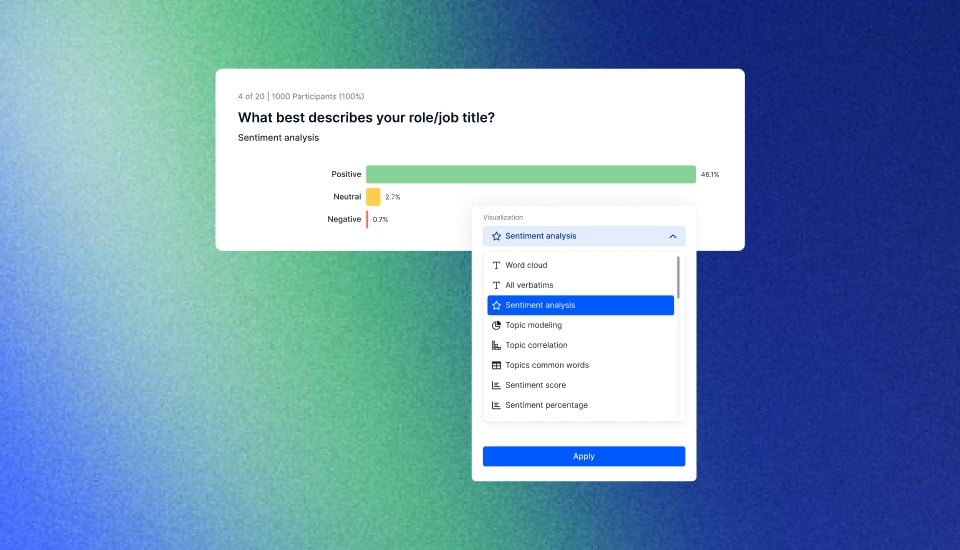
- Appinio: Appinio is a real-time market research platform that empowers Interaction Designers to gain instant consumer insights for making data-driven design decisions. With Appinio, you can turn questions into insights in minutes, making it an invaluable addition to your toolkit.
- Google Analytics: Google Analytics offers comprehensive website and app analytics, including user behavior, demographics, and traffic sources. It helps you understand how users interact with your digital product.
- UserTesting: UserTesting is a platform that allows you to conduct remote usability testing with real users. It provides video recordings and feedback on user interactions.
- Hotjar: Hotjar is a tool that offers heatmaps, session recordings, and surveys to understand user behavior and gather feedback.
- SEMrush: SEMrush is a comprehensive SEO and competitive analysis tool. It helps you research keywords, track search rankings, and analyze competitors' digital strategies.
Collaboration and Design Handoff
Collaboration and design handoff tools facilitate communication between designers and developers, ensuring that design intentions are accurately implemented.
- Zeplin: Zeplin simplifies the handoff process by generating design specs and assets for developers. It provides a seamless bridge between design and development teams.
- Abstract: Abstract is a version control platform specifically designed for design files. It enables collaborative design workflows and helps teams manage design iterations.
- Trello: Trello is a visual project management tool that can be customized to accommodate various workflows. It helps teams track progress and tasks related to design projects.
Version Control and Documentation
Maintaining version control and clear documentation is crucial to keep track of design iterations and changes.
- GitHub: GitHub is a widely used version control platform that allows teams to collaborate on code and design files. It provides version history, branching, and merging capabilities.
- GitLab: GitLab offers similar version control features to GitHub but can be hosted on your own servers for added privacy and control.
- Confluence: Confluence is a collaborative workspace tool that enables teams to create and maintain documentation. It's useful for capturing design decisions, meeting notes, and project documentation.
Integrating these protocols and tools into your Interaction Design workflow can enhance collaboration, streamline processes, and ensure that your designs are well-documented and version-controlled throughout the development cycle. These resources empower you to create digital products that align with user needs and expectations while maintaining efficiency and accuracy in your design process.
Conclusion for Interaction Design
Interaction Design is the art and science of creating digital experiences that are not only visually appealing but also intuitive and user-centered. You can craft interactions that leave a lasting impact by prioritizing user needs, mastering design principles, and utilizing the right tools. Remember, Interaction Design is an ever-evolving field, so stay curious, keep learning, and always put the user at the heart of your design journey.
In today's digital landscape, where user expectations are continually evolving, the role of Interaction Design has never been more critical. Your ability to create seamless, engaging, and accessible interactions can make or break the success of a digital product. So, whether you're designing a website, mobile app, or any other digital interface, the principles and practices outlined in this guide will serve as your compass to navigate the exciting and ever-changing world of Interaction Design.
Collect feedback for your design and visual testing
In the fast-paced world of Interaction Design, the need for real-time consumer insights has never been more crucial. Meet Appinio, the real-time market research platform that empowers designers to create exceptional user experiences. Appinio takes the heavy lifting out of research so you can focus on what truly matters – making data-driven decisions that resonate with your audience. Here's why Interaction Designers love Appinio:
- Swift Insights: With Appinio, you can turn questions into insights in mere minutes. No more waiting for lengthy research reports; get the data you need when you need it.
- No Research Degree Required: Our intuitive platform is designed for anyone, whether you're a seasoned pro or just starting. You don't need a Ph.D. in research to conduct valuable studies.
- Global Reach: Define your target group with precision from over 1,200 characteristics and survey it in 90+ countries. Appinio ensures your designs resonate with diverse audiences worldwide.
Get facts and figures 🧠
Want to see more data insights? Our free reports are just the right thing for you!